

No. 62 (Fall/Winter 2025)
Little Boxes
Paul J. Erickson
Randolph G. Adams Director
William L. Clements Library
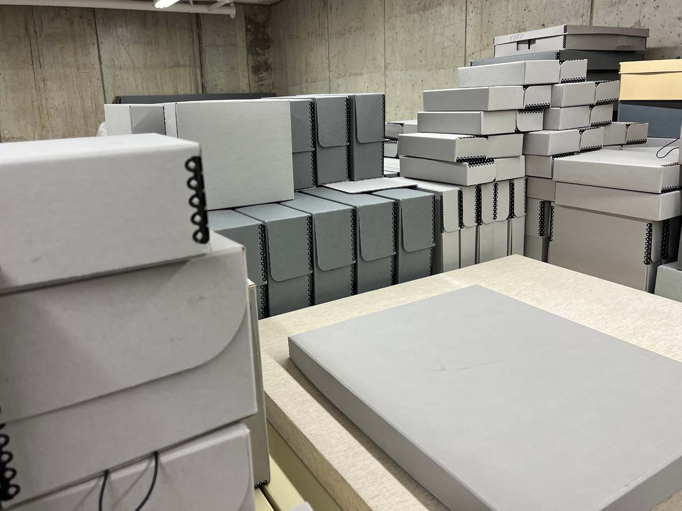
People ask me all the time what my job is like. Directing a rare book library and archive of early American history is not something that a lot of people realize is a thing that someone might get to do. And I usually tell them the truth: my job is a huge amount of fun. It’s deeply satisfying to help students, researchers, and instructors find ways to answer questions by using one of the best collections of early Americana in the country.
But I don’t usually tell them the complete truth. Because, if I were being honest, I would tell them that a lot of my job is about something that they might not find so exciting: Boxes. I spend a lot of time thinking about boxes. A good portion of every week is dedicated to opening boxes, which is exciting, since that usually means new additions to the collection. But it can also be a lot of boxes. This past year I bought my own personal box cutter — it’s bright purple, so I won’t lose track of it — and using a tool that is fit for purpose has made the box-opening work more pleasant.
In addition to the boxes that arrive holding the books and manuscripts and prints that we buy, we also buy a lot of other boxes (which arrive in boxes of their own). These boxes are acid-free library storage boxes that we use to safely house collection materials. What is a lot of boxes? Well, in the past twelve months we have spent over $25,000 on storage materials at the Clements Library, and the vast majority of that has been spent on boxes. And if we have something that is an irregular size that doesn’t fit well in a standard size storage box, Senior Conservator Julie Fremuth will create a custom box for it.
Ironically, many of the items that we are putting into those nice new library storage boxes are being removed from … you guessed it, other boxes. We are in the midst of rehousing the Henry Clinton Papers, which for the past eighty years have been stored in big hinged boxes that are designed to look like books. The Clinton Papers are one of our largest manuscript collections, over a hundred shelf feet. Which means that we have to figure out what to do with all of those boxes.
But nobody who asks me what my job is like wants to hear about how I’m really in the box business, so I don’t tell them. Then why am I telling
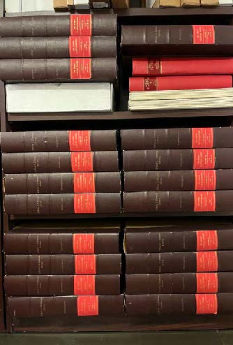
These boxes, now empty, used to hold the Henry Clinton Papers, one of the library’s most heavily-used manuscript collections. Preparing them for digitization involves removing them from these acidic boxes and moving them to acid-free boxes like those pictured above.
you? Because the theme of this issue of The Quarto is “Contain Yourself.” It’s about the things that hold (or held) the things in our collection that researchers come to use. The frame around the picture, the envelope that carries a letter safely to its destination, the printed box that holds a board game, homemade bindings on books.
Most of the time, these containers are, for us at the Clements, of secondary interest to the things they hold. It is true that when we’re buying things like 19th-century board games, we look for examples with intact boxes, not least because the game instructions are often printed on the box. But we don’t usually collect empty game boxes, just as we don’t collect empty daguerreotype cases or envelopes without letters (although there are many people who do).
Many of us probably have at least one box of letters or pictures on a shelf in a closet that we can’t bring ourselves to throw away, but that we also probably never open. By keeping them in a container, we keep ourselves safe.
Still, just because these containers are not our primary collecting interest does not mean that they don’t have a lot to tell us about how people in the American past lived with books and images. When people looked at the books on their shelves, they saw the bindings, not the contents. Visually, people experienced much of the world of words indirectly, through the containers that held and organized those words. The way that people in the past framed pictures of loved ones can tell us a lot about what those relationships meant, just as the way that people decorated envelopes they sent through the mail can tell us a great deal about how they felt about the person they were writing to.
“Contain” is a word that can mean a lot of different things. To take the example of the acid-free boxes that we buy at the Clements, we use those to contain manuscript collections, newspapers, prints — things that we want to keep organized, but even more so things that we want to protect. If old letters or newspapers were just kept in piles on the shelf, their edges would get snagged and torn every time someone walked past. We put those things in containers to protect them from harm.
But to contain something is also to keep it from harming us. We work to contain oil spills, or forest fires. We also put things in containers to protect us from what’s inside. Old letters and photographs can be painful. They can remind us of heartbreak, of the death of loved ones, of ways that we failed those we care about. Many of us probably have at least one box of letters or pictures on a shelf in a closet that we can’t bring ourselves to throw away, but that we also probably never open. By keeping them in a container, we keep ourselves safe.
One of the standard stops on any tour of the Clements Library is a visit to two big boxes, at the west end of the reading room. On the bottom shelf of a two-tiered wooden stand is Henry Clinton’s uniform trunk, an elaborately embellished leather-covered piece of luggage created for the commander in chief of Britain’s forces in North America. We talk more about the box on the shelf above it, a more prosaic square wooden trunk covered in heavy canvas. It is one of twelve document trunks that held the correspondence of General Thomas Gage during his stint as commander in chief, from 1763 to 1775 — one trunk per year. (We only have three left, which is a story for another Quarto.)
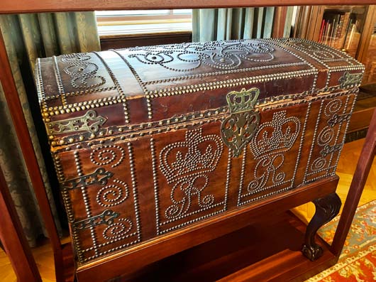
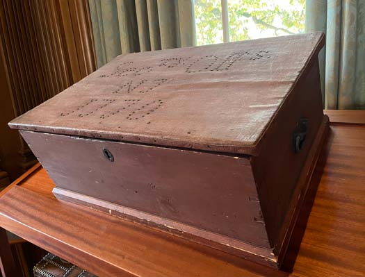
Two of the most-visited artifacts in the Avenir Foundation Reading Room are, well, boxes. At top left is General Henry Clinton’s uniform trunk, which came along with the purchase of the Clinton Papers. The other two images show General Thomas Gage’s documents trunk—one of twelve trunks that originally held the Gage Papers in the 18th century. Inside the trunk are two levels of cubbyholes (the top tray is removable). Each section represents a different location.
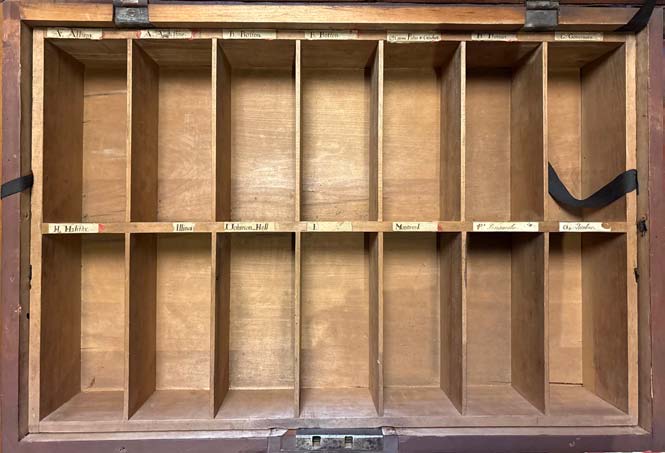
As many of you have seen, the Gage trunks are organized into two layers of cubbyholes, which are labeled according to geography. While the manuscripts in the Gage Papers are essential to understanding the coming of the American Revolution, I’d argue that the trunk is essential to understanding Thomas Gage. He was a man who was responsible for a continent — all of Britain’s colonial possessions in North America. How he physically contained his letters tells us a lot about how he organized his thoughts, and about how he approached his job. Maybe the box business isn’t so boring after all.
Vernaculopegy
Emiko Hastings
Curator of Books
Earlier this year, the Clements Library Book Division made an exciting acquisition with the purchase of the Garrett Scott Collection of Vernacular Bindings. Scott, an antiquarian bookdealer in Ann Arbor, coined the term “vernaculopegy” to describe the art of vernacular bindings, derived from the term “bibliopegy” for the art of bookbinding. His working definition of “vernacular binding” is “an alteration or addition to the book, pamphlet or leaf, when this alteration is made by an owner whose vocation is not bookbinding or associated book arts, when this modification is meant to enhance, protect, repair, or reinforce the structure of the item.” In other words, these are books that have been modified and repaired by their former owners. Amendments such as handmade book coverings and visible repairs are evidence of the ways that these books were used and cared for by previous generations.
The intention of the vernacular binding collection, as Scott writes, is to “open the doors to historical everyday users.” His manifesto urges book dealers and owners to notice and value these bindings in their own right, and not simply discard them as ugly or clumsy repairs. In this respect, it is as much a collection of evidence of reading and book ownership as it is of books. Including more than 300 volumes, the collection contains numerous examples of overcovers, added paper wrappers, and non-professional repairs such as rebacking and visible sewing.
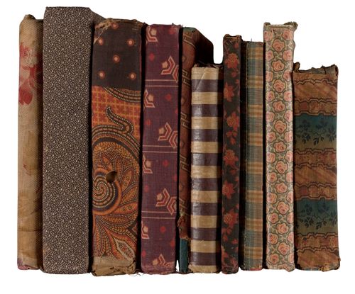
Stack of cloth overcovers
The new vernacular binding collection complements existing examples in the Clements Library collections and bolsters a long-standing interest in describing these types of bindings. A number of years ago, the binding historian Julia Miller did a survey of the library’s bookbindings and wrote descriptions of many of them that have been added to the library’s online catalog. Some of this work is discussed in Miller’s Books Will Speak Plain: A Handbook for Identifying and Describing Historical Bindings, first published in 2010 and revised and enlarged in 2023. Miller encourages readers to notice and appreciate ordinary or plain historical bindings as well as decorative ones, and respect repairs made to a book as evidence of the history of that particular book. She writes, “A book with its mends is, like a life, much worked upon, as we strive to continue whole and productive. Historical bindings, even broken and mended, still have a lot to tell us.”
After seeing the varied and creative ways that previous owners cared for and repaired their books, one can appreciate the subtle beauty of these bindings. Although at first glance the books may appear shabby or dilapidated, the mending is actually a sign of care taken to preserve the book, as well as a display of dexterity and skill on the part of the owner. At a time when books were relatively expensive, people were less likely to discard a damaged book. If they lacked the means to hire a professional bookbinder, a thrifty person might well attempt to repair it at home in order to keep the book in working order. Most book-owning households would likely include someone with the necessary mending skills and access to scrap materials of cloth, paper, or leather. Although we usually do not know the identity of the person who did the work, given the categorization of domestic sewing as feminine labor, I speculate that much of this work was carried out by women.
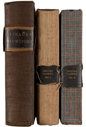
Window cutouts
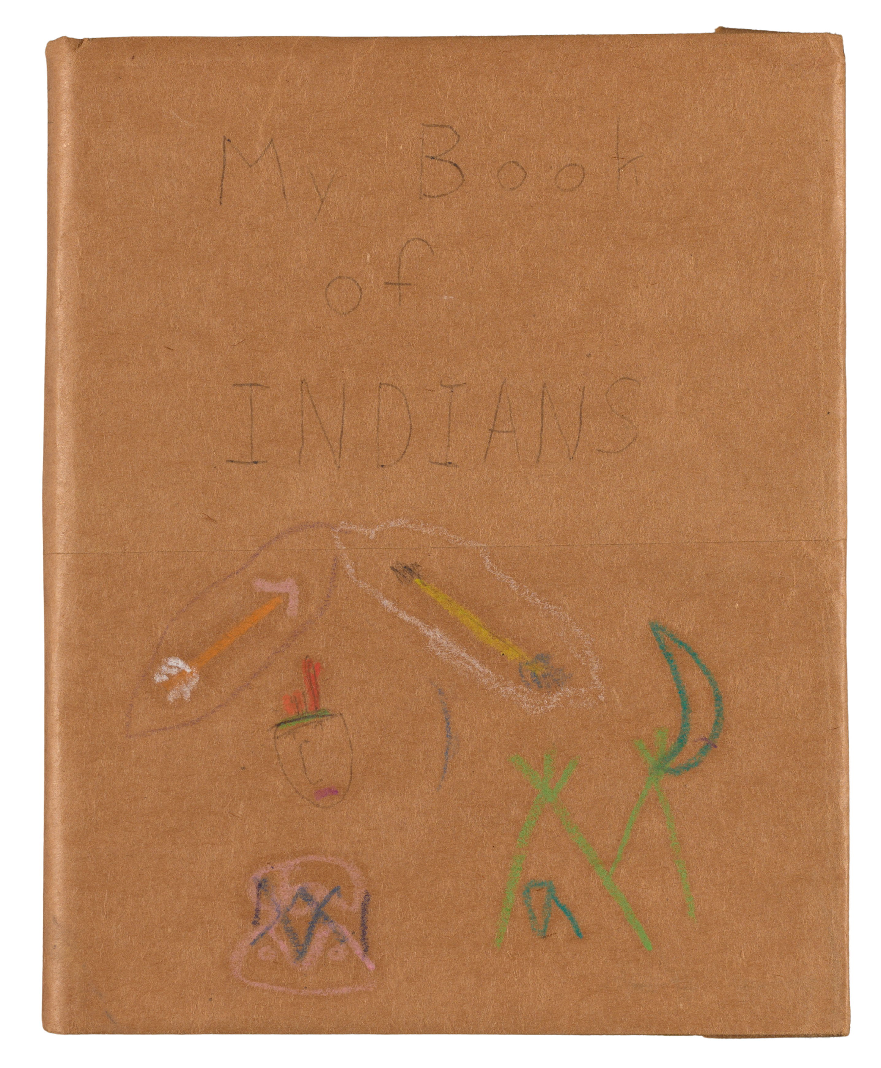
Garrett Scott paper cover
While repairs are more common for cheaper books, they do not necessarily indicate that the owner did not value the book. As Miller notes, amateur repairs are common in “working books” like dictionaries, textbooks, and manuals that would have been heavily used and needed to remain functional. Vernacular bindings are also seen on well-loved but tattered books that were “read to pieces,” such as children’s books and music books, as well as personally meaningful volumes like prayer books and Bibles. The elements most likely to need repair are the hinges of the book, which sustain damage over time as the book is opened and closed repeatedly. This can be handled by crafting an overcover to hold the boards onto the text block, by repairing the spine with new material, or by stitching the boards back to the text block.
Overcovers
The most common type of vernacular binding in the Scott collection is the overcover, an added covering or book jacket over the primary binding of a book. Some are made to hold together damaged bindings, while others protect undamaged bindings from additional wear and tear. They are most frequently made of cloth but can also be made of leather or paper. Like a modern publisher’s dust jacket, they can be both functional and decorative. Many of the cloth examples use brightly colored and patterned fabrics, likely recycled materials from clothing or other domestic sewing projects.
The overcover seems to have been a folk repair or decoration that arose naturally from the skills and materials that people had readily available, something that Miller describes as an “intuitive similarity of design.” I have yet to find any contemporary published sewing patterns or instructions that describe how to make these common overcovers. Periodicals like Godey’s Lady’s Book tended to focus on decorative velvet or embroidered silk book covers rather than functional covers for damaged books. One of the most distinctive features of the overcover, which I have not seen mentioned in published instructions, is the long zig-zag tensioning stitches usually holding the head and tail material in place. It seems likely that this method was inspired by similar fastenings for other home goods such as corset lacing or chair upholstery.
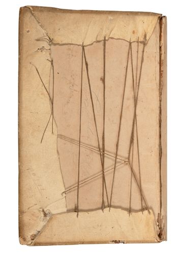
Removable cover showing original binding and overcover
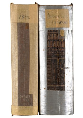
Examples of rebacking styles, duct tape
Rebacking
Rebacking a book is a technique by which a damaged book spine is replaced and the boards reattached. In traditional bookbinding, this usually involves inserting new spine material underneath the existing cover material, and the original spine is often pasted back over the new spine to preserve its appearance. The examples of amateur rebacking in this collection differ in that the new spine material is pasted or sewn over the primary cover rather than inserted underneath, making the repair more obvious but still functional. This repair method is a straightforward solution to a problem, similar to the way a modern book owner may use adhesive tape to repair their book.
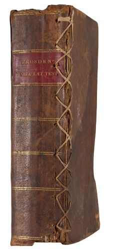
Frankenbook stitching
Stitching
Stitching is also a popular folk mending method to reattach boards, fasten loose gatherings, or mend torn paper. For women accustomed to mending their own clothing and household linens, sewing must have been a natural choice for home book repair, particularly in an era when much paper was made from cotton and linen rags, and thus was effectively a type of fabric. Before the invention of transparent adhesive tape in 1930, needle and thread would likely have been the most convenient way to mend torn paper at home. Indeed, it was even advised by at least one etiquette book, Eliza Leslie’s The Behaviour Book: A Manual for Ladies (Philadelphia, 1853). The author wrote, “If, by any unlucky accident, a leaf is torn, lay the two pieces neatly together, and sew them, lightly, with a rather fine thread.”
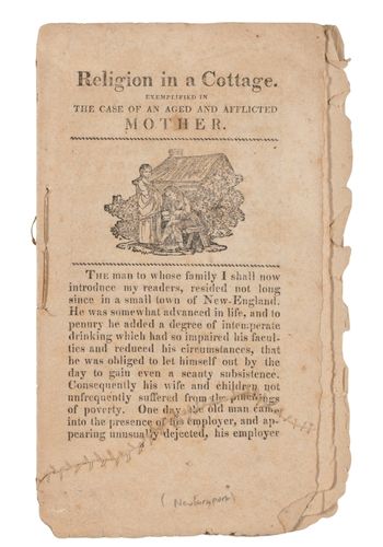
Repairing a page with sewing
Books with exposed exterior stitching repairs are also colloquially known as “Frankenbooks,” a term coined on Instagram by the American Antiquarian Society. A post by Galter Special Collections says, “Similar to Frankenstein’s monster, Frankenbooks are books that have been stitched back together to give them new life.” The stitching may look crude compared to what a trained bookbinder would have done, but if done carefully, it can still prolong the life of the book and restore its function.
Embellishment
Lastly, the definition of vernacular bindings can encompass other decorative additions to the book made by an owner, such as cover embellishments or artwork on the endpapers. These can range from doodles likely done by a child to exquisitely detailed ownership inscriptions and embroidery work.
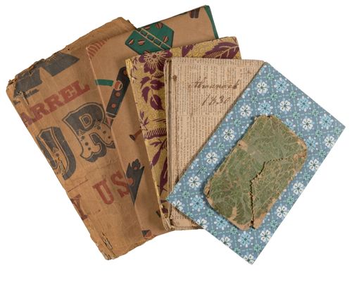
Added wrappers
Traditionally, rare book collectors such as our founder, William L. Clements, prioritized books in pristine condition or with decorative bindings made by skilled craftspeople. Likewise, librarians and book historians have often focused their attention on the most lavish or unusual binding examples rather than the ordinary styles of bindings most often encountered on library shelves. While plain bindings and folk repairs have always existed in the Clements book collection, they were not necessarily considered worth describing in detail until binding scholars like Julia Miller began to generate more interest in the subject. Today, those who study book history and bookbinding have come to appreciate such repairs and other traces of former ownership, part of a growing interest in marginalia and other provenance evidence of past readers and owners of books. Far from detracting from the value of a book, these alterations can help us learn how readers of the past used their books in everyday life. We are excited to begin cataloging the Scott Collection so that it can be made available for study and to encourage similar collecting efforts by other institutions and private collectors.
Enveloped
Jayne Ptolemy
Associate Curator of Manuscripts
Admit it. When going through your mail, besides a cursory glance, you don’t really pay much attention to the envelope. We rip it open to get to the good stuff (or the bill. These days it’s usually a bill.) Regardless, the envelope isn’t the point; it’s just the packaging. In the library world, we’re guilty of this, too. Browse our finding aids, and you’ll see detailed descriptions of a collection’s content and then the ubiquitous phrase “… and empty envelopes.” We’ll count them, sure, but we absolutely will stack them in a folder at the back of the box and expect almost no one to look at them seriously. Like most things in life, though, once you shift your perspective and look more closely, give attention to the smaller or seemingly insignificant things, there’s so much more to learn.
An envelope can reveal a lot about the sender’s personality or intentions. Before the nineteenth century, postal charges were largely calculated by the number of sheets being sent. To save money, most letters were simply folded upon themselves and sealed with wax, and the address was written on the blank panel of the back page. By 1845, postage charges were being calculated by weight and distance, meaning that using an envelope made far more sense. With literacy booming and populations becoming more dispersed, by midcentury, letters safely nestled in their envelopes were being sent in record numbers. To meet the demands, machines were built to automate the production and gumming of envelopes. A correspondent’s trip to the local stationer would reveal a whole range of options in how to write and send mail.
While most letters would still be sent in a regular, blank envelope, the ways writers chose to indulge in different stock can spotlight some of their underlying motives. For example, the intricate, lacy envelopes used for Valentines amplified the enclosed love message, making it feel all the more precious despite being so obvious.
Stationers sold a variety of envelopes for specific occasions, ranging from eye-catching vibrant purples to somber black-edged ones to indicate mourning. The beautiful sets of mourning stationery in the Patricia Wilczak Funeralia Collection show how these goods would have been packaged and sold in stores.
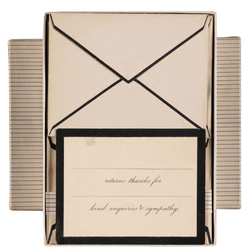
The Patricia Wilczak Funeralia Collection includes boxes of mourning stationery, with their black-edged envelopes, which would have been used by those who had experienced a loss.
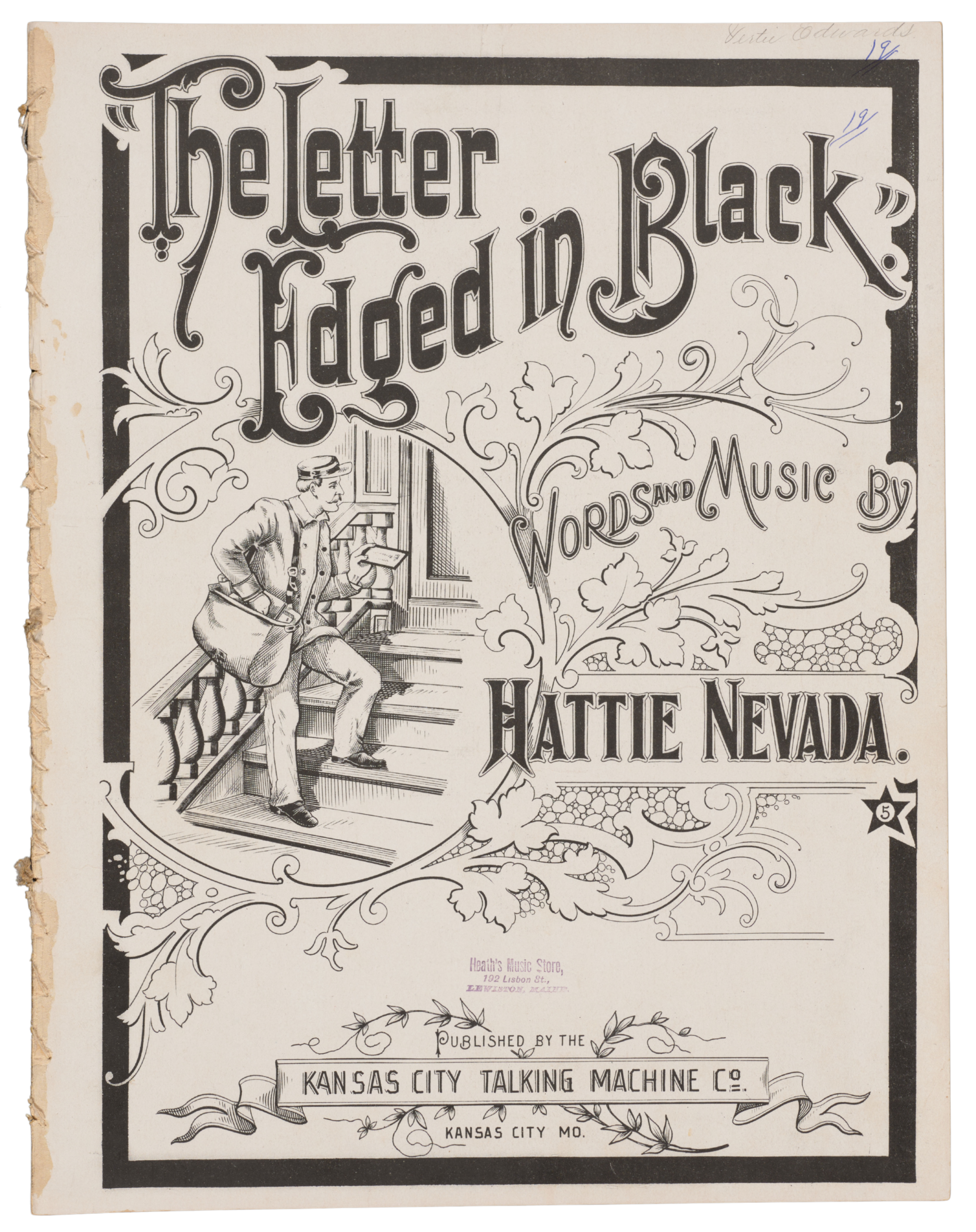
This sheet music from 1897 shows how deeply the black-edged mourning stationery was ingrained into the public imagination by the end of the century.
From the plain beautiful to the interactive to the amusing, writers used their envelopes as an illustrated complement to their written correspondence.
As part of elaborate 19th-century death practices, the bereaved could purchase writing paper and envelopes with black borders whose width signaled the “nearness of the relationship, and the recentness of the bereavement.” The chilling effect of seeing a postal delivery of such an envelope quickly entered the cultural lexicon. The illustrated sheet music for “The Letter Edged in Black” shows a mail carrier holding the dreaded black-edged envelope. The refrain homes in on this visual cue’s impact: “As I heard the Postman whistling yester-morning coming down the pathway with his pack, O he little knew the sorrow that he brought me, when he handed me a letter edged in black.” This tradition was one that lasted, as Hattie Nevada’s song would be recorded by numerous artists, including Marty Robbins, Slim Whitman, and Johnny Cash.
While options for printed envelopes were becoming increasingly available throughout the 19th century, if a writer’s talents and inclinations allowed, some chose to embellish their envelopes themselves. Examples of drawings,
fine lettering, and designs of all types indicate a widespread awareness that pouring a bit of time and artistry into an envelope was a way to have your letter stand out or to signal your care. From the plain beautiful to the interactive to the amusing, writers used their envelopes as an illustrated complement to their written correspondence. These drawings, at first glance, can seem like they’re just whimsy, but they’re also doing something quite meaningful. When mail comes to your hand and contains not just a written message but evidence that someone chose to spend time to bring you delight, you feel it. It’s no mistake that these envelopes were saved, even sometimes without their corresponding letter.
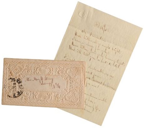
The beautiful embossed envelope lends additional romance to this rhyming Valentine’s poem from 1858 in the Women, Gender, and Family Collection.
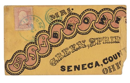
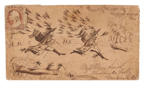
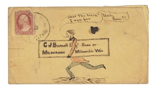
These three envelopes from the Pen-and-Ink Collection were hand-illustrated by different writers, but they’re united by their desire to stand out amid a flood of other correspondence.
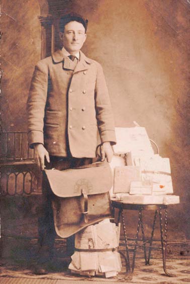
This photo postcard of a heavily encumbered postal deliveryman from Detroit can be found in the David V. Tinder Collection of Michigan Photography.
By the 1860s, the combination of chromolithography and new mechanical processes to produce envelopes changed the game. Patriotic covers became a way to declare your political allegiances in times of upheaval; businesses could advertise themselves on the outside as well as the inside of their mailings; and people’s creativity blossomed to take advantage of the medium. If you have the option to expand the scope of your message, and it’s cheap to do so, why not use every square inch of paper? Bright colors, smart designs, dense text—in the late 19th century, innovative printers revolutionized people’s ideas of what an envelope could be.
Letters, and their envelopes, can tell us grand narratives about postal history and the steady advance of industrialization, technology, and communication, but they’re also a reminder that it’s only by looking at all the evidence before us that we can really get a glimpse of the people who came before us. So zoom in and be curious. Look closely, for example, at all the mail just this one U.S. Postal Service employee from Detroit was carrying with him: newspapers, letters bundled together with twine, parcels wrapped in paper, and many envelopes with stories of their own to tell. After all, a library like the Clements is a testament to just how much people have written down in the past, and all the ingenious ways they’ve devised to carry, save, and treasure these records.
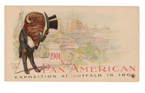
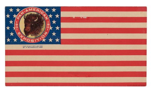
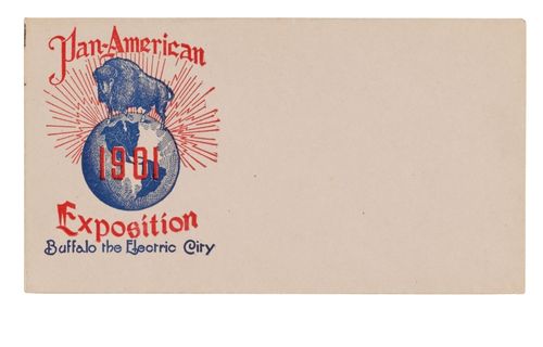
These printed envelopes from the Postal History Collection advertise the 1901 Pan-American Exposition, and the memorable visual messaging surely underscored the public’s awareness that it was happening in BUFFALO, New York.
Outside the Box
Sierra Laddusaw
Curator of Maps and Graphics
Visually tantalizing packaging has always helped sell a product. As printing technology advanced, color became a key design element in helping make products appealing to potential customers. In the 1830s, the color printing process of chromolithography opened the door to the mass production of vibrantly colored printed works. Across all of the collecting divisions at the Clements Library, you will encounter countless examples of chromolithographed prints used in a multitude of ways: as book covers, letterheads and billheads, separately sold prints, and box labels. While games have existed in various forms for centuries, the emerging American game publishing industry made particularly extensive use of this new printing technology.
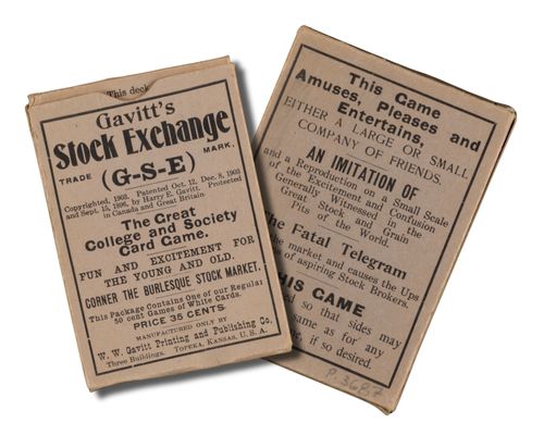
Gavitt’s Stock Exchange was issued in a classic tuck box.
Milton Bradley is often credited with creating the modern board game industry, and it should come as no surprise that he was a pioneer in producing games with appealing boxes, since his first commercial venture was as a lithographer.
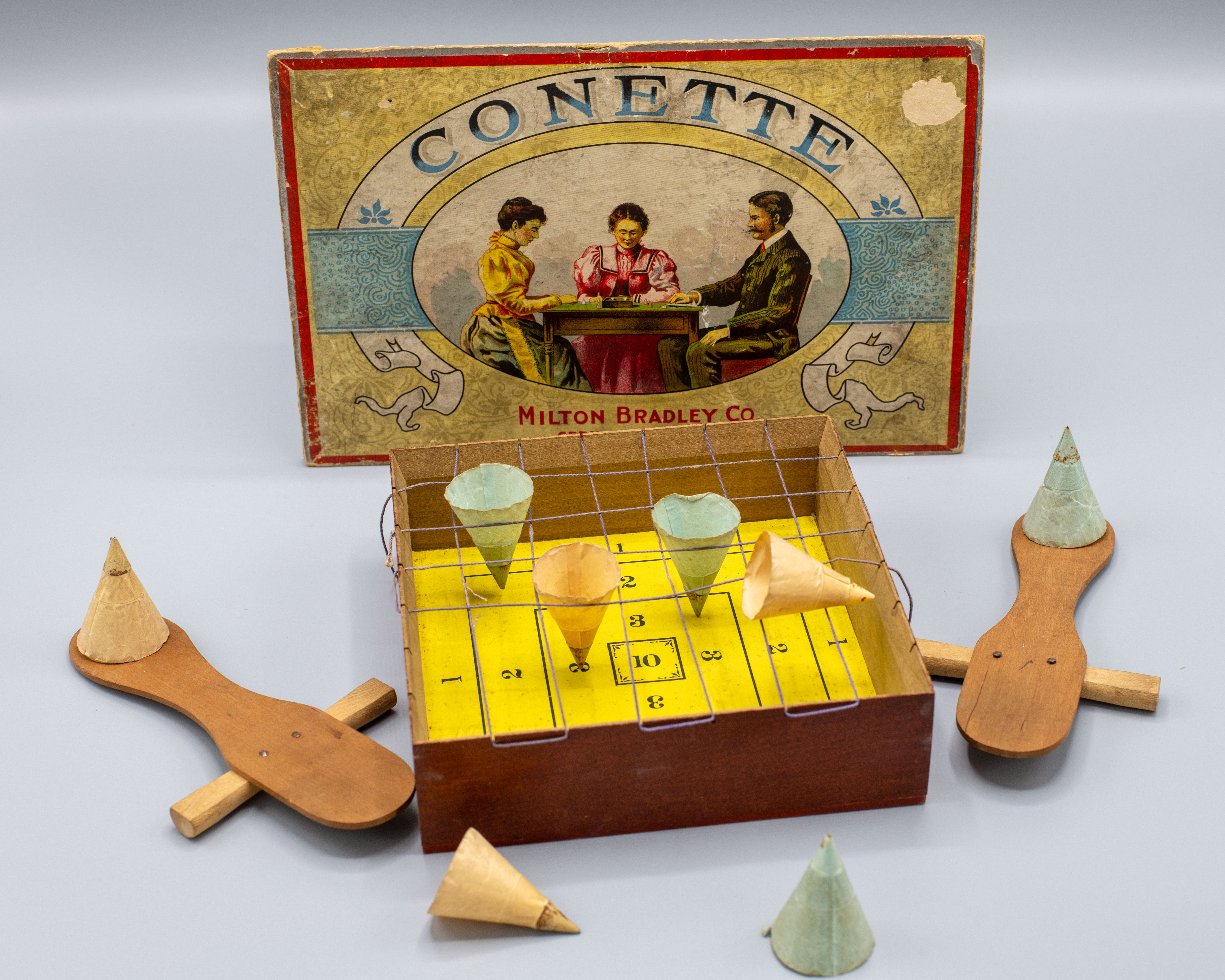
The two-piece box that holds Conette features a colorful illustration of three adults playing the game.
The humble game box hasn’t changed much since the 19th century. If you enter your local board game store today, you will find a variety of games housed in colorful tuck boxes and two-piece boxes. Tuck boxes are most often used for card games and are made by folding thick paper and tucking in the ends. Gavitt’s Stock Exchange (Gavitt Publishing & Printing, 1903), a card game where players trade “stock” in an attempt to corner the market, was issued in a tuck box printed on all sides in a variety of typefaces and sizes. Two-piece boxes, as the name implies, are two separate boxes that when put together form a lid and base. The lid box is slightly larger than the base box and slides over it when closing the box. Milton Bradley’s 1898 game Conette is a good example of a two-piece box, with the illustrated lid fitting tightly over the base. Bradley is often credited with creating the modern board game industry, and it should come as no surprise that he was a pioneer in producing games with appealing boxes, since his first commercial venture was as a
lithographer (he published a portrait of Abraham Lincoln that failed miserably as it depicted Lincoln just before he grew his famous beard). Bradley was acutely aware of the power of images to drive sales. Game publishers both past and present could simply decide to manufacture plain packaging and focus their attention on the design of the game inside. But in the American game publishing industry, that has never been the case.
Think about the container of your favorite game and what it looks like. It probably has a colorful box, designed to entice a shopper into picking it up, turning it over to see all its sides, and then purchasing it for play at home. The design on the box might depict people playing the game, like
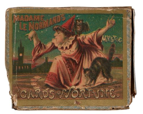
The box for Madame le Normand’s Mystic Cards of Fortune is illustrated with a fortune teller and her cat.
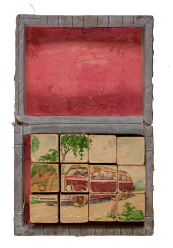
These picture puzzle blocks from Klee (circa 1940) are kept in a heavily home repaired box.
the box for Conette, which shows shoppers how the game is set up and a group of three adults playing. Other box designs were more fanciful, creating an entirely fictional scene. Madame le Normand’s Mystic Cards of Fortune (McLoughin Bros., 1887) is illustrated with a fortune teller decked out in medieval garb and accompanied by a black cat, reading someone’s fortune. In both cases, shelf appeal was the point.
While game boxes are designed to be durable, inevitably the boxes of frequently played games fall apart, as most boxes are made from paper or cardboard. The corners get dented in when dropped. The seam holding the box together separates. The entire box gets smashed, with the sides collapsing out. Today, you might use tape to repair a broken game box. The previous owner of one game at the Clements, a set of picture puzzle blocks (Klee, circa 1940), repaired the game’s box by wrapping and gluing cloth around the box. Other games in the collection are housed in boxes made at the library. Abbott’s Drawing Cards (Saxton & Miles, 1845) was originally issued in a tuck box. Over time, that box has fallen apart, and all that remains are two sides. To store and protect the cards and what remains of the original box, the Clements Library conservator built a custom tuck box for the game.
The next time you’re having a game night, take a moment to enjoy the container your game is stored in. While someone worked hard to create the game itself, another person put thought into the illustration, colors, and type of box the game is housed in.
To see more games from the William L. Clements Library collection, visit the online exhibit “For All Ages.”
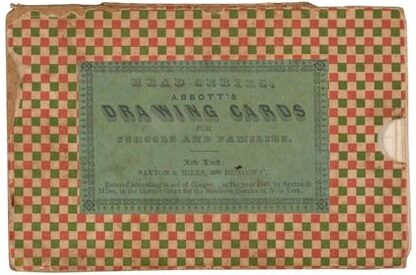
Abbott’s Drawing Cards lack their complete original box and are now stored in a custom-made tuck box made by the Clements Library’s conservator.
Threads (Not) to Pull On
Maggie Vanderford
Librarian for Instruction and Engagement
Imagine that you have two items on a table in front of you. One is an impressively formal manuscript wedding certificate, dated May 14, 1838, and signed by various witnesses — many of whom were leaders of the abolitionist movement in the antebellum United States. The other item is a small ivory moiré silk wedding purse, hand-painted with popular, sentimental engravings depicting the plight of enslaved women. Now take a moment to think: Which item tells you more about that wedding day? Which one would you use as “evidence” in a research paper about the wedding? Which gives you better insight into the bride? The groom? Their relationship?
These questions, developed with Associate Curator of Manuscripts Jayne Ptolemy, are ones we regularly pose to students in History 202 as part of their introduction-to-the-archives experience on their visits to the Clements Library. Of course, no “right” answer exists. Our only goal is to push them to make an argument — any argument — about the role of community in religious ceremonies, fashion as personal advocacy, the use of visual images in the abolitionist movement, or any number of other approaches depending on their interests and questions. As they learn in this class and in their future archival work, sources will not often explicitly tell you which historical arguments they can be used to support. It is often the work of the historian to, as our colleague Dr. Rebecca Scott describes it, “get the documents to speak.” More often than not, students leave their first archival visit with more questions than answers: When did women begin carrying wedding purses? When did they stop? Was it common to use fashion as a political statement in the 19th century? Why was William Lloyd Garrison at the wedding? This organic, genuine curiosity inspired by the in-person encounter with material artifacts from the past has always seemed to me an ideal way to initiate a relationship with the archive and its possibilities. Both the wedding certificate and the purse are indeed part of a cornerstone collection at the Clements Library, the Weld-Grimké Family Papers. These specific items relate to the marriage of the famous abolitionist-activist couple Theodore Dwight Weld and Angelina Emily Grimké Weld.
The wedding certificate indeed lists the names of dozens of prominent abolitionists attending what was as much a high-profile advocacy gala as it was a celebration of love.
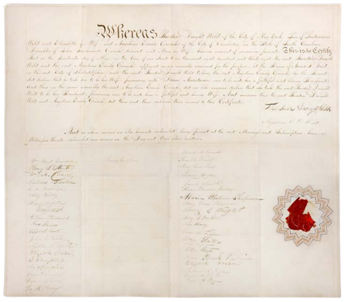
The Clements Library holds the wedding certificate documenting the marriage of Theodore Dwight Weld and Angelina Emily Grimké Weld, celebrated on May 14th, 1838. The certificate bears the signatures of many prominent abolitionist attendees from around the country, including William Lloyd Garrison.
At least, they might be? As I sat in my office after a recent class session (pleased as punch with our innovative approach to primary source instruction and patting myself on the back for a job well done), I took a closer look at the finding aid for the Weld-Grimké Family Papers. While the wedding certificate is undoubtedly the genuine article documenting their wedding day, the purse is described as “possibly Angelina’s wedding purse.” Suddenly, I found myself drawn into the same rabbit holes I regularly ask our students to climb down. Possibly? Had we been asking the wrong question all along? And had I been misleading our students about the origins of this purse
As it turns out, little evidence exists to definitively affirm or deny the possibility that Angelina walked down the aisle or attended the reception with this specific bag in hand. Newspaper articles about the wedding did describe her wardrobe — a brown dress, reminiscent of the Quaker imperative regarding “plain dress” — made with “free cotton,” sourced from producers that did not use enslaved labor. The wedding itself was an unprecedented abolitionist spectacle and was strategically designed to employ only vendors who supported the cause. The wedding confectioner was a baker of color who used “free sugar” in the cake itself, and the event invitation featured a letterhead with the famous “kneeling slave” motif designed by Josiah Wedgwood — the very icon painted on our silk purse. The wedding certificate indeed lists the names of dozens of prominent abolitionists attending what was as much a high-profile advocacy gala as it was a celebration of love.
Materially, the purse certainly makes a statement in line with the ethical goals of the wedding. On one side of the purse is a hand-painted version of an engraving by English designer Samuel Lines, depicting a female slave holding a child in her arms and seemingly in distress. On the reverse is the iconic kneeling slave symbol, modified from Wedgwood’s original medallion design to portray a female slave. The medallion was originally produced in 1787 for the Committee for Effecting the Abolition of the Slave Trade, but reproduced in 1828 to bring attention to the plight of female slaves. Both images were powerful, popular, and immediately recognizable images meant to evoke the intensity of feeling that drove the abolitionist movement. As such, they were printed and distributed on all sorts of materials, from pincushions to jewelry to prints and even bags. The silk purse in the Clements collections is nearly identical to other drawstring purses produced by the Female Society for Birmingham, which created and sold these fashionable accessories to wealthy abolitionist women in Britain. However, while other similar versions exist, no known version is actually identical to the Clements purse. Other purses held by the Victoria & Albert Museum, the Daughters of the American Revolution, and various historical societies all feature anti-slavery poetry printed on the back of the purse, rather
than a verso image. Moreover, the close eye of Clements Library Conservator Julie Fremuth detects that the Clements purse appears not to be printed, but hand-painted and embellished with an iron gall ink to add dimension and tone. If not completely unique, it is at the very least distinct.
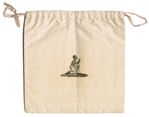
The handpainted silk purse held in the Weld-Grimké family papers is double-sided to feature two iconic images often utilized by the anti-slavery movement.
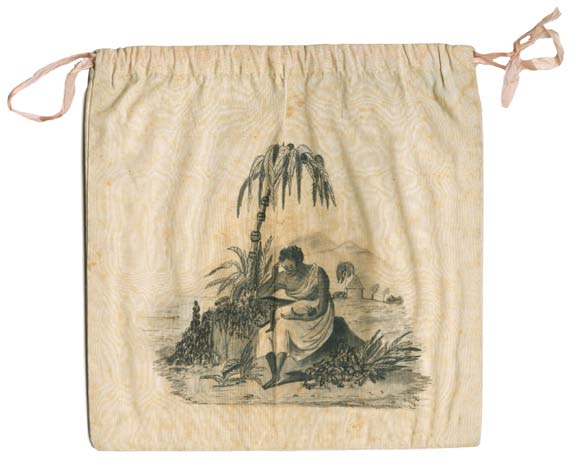
And thus, more questions arise. Did Angelina receive the purse as a special gift, or did she purchase it as a keepsake on one of her speaking circuits? Did she carry it at her wedding, or did it live in her armoire as a collectible item? What did owning a luxury item like this mean to a woman who lived her life in muted browns, blacks, patterns, and other “plain dress”? How did she understand the political implications of fashion? Even if she didn’t carry it at the wedding, how would she have used it or looked at it? If someone living 100 years from now plucked an item from your closet, could they learn something about you from studying it? Research questions, one and all.
Even as I am frustrated and humbled by the ways in which this particular document won’t speak to me as I wish it did, I realize how productive it is for archives to push back on our preconceived notions of the past, dispelling easy conclusions and adding complexity back into conversations. But this complexity can also sometimes be disappointing. I have questions about what Angelina carried in this purse — questions that I can’t answer. But I also have questions about what I’ve asked this purse to carry, both for me and my students. Thinking that Angelina carried the purse at her wedding gave me license to think about what it could tell me about her, about that day, and about her life. But not knowing whether it was used in this way sends those assumptions sideways. I had asked the purse to carry intellectual baggage that it can’t actually hold. This is a difficult lesson of teaching with archives, but also one of the most important.
Who Framed Joseph Keppler?
Naomi Yu
Clements Library-UMSI Intern
If you go into any family home in the United States where children live, the odds are very high that you will encounter portraits of those children in some form: framed and arranged on a table, attached to the refrigerator with magnets, populating the hallways, etc. The U.S. tradition of displaying portraits of one’s children is a long-standing one. These images often serve two purposes: first, to present children at their best, inviting admiration from visitors; and second, to complement the home’s decor, neatly filling empty spots on the wall. With these familiar motivations in mind, I will focus here on a truly unique example of child portraiture that recently arrived at the Clements Library.
This past July, the Clements was delighted to purchase from noted rare book and periodical dealer Richard West his personal collection of illustrated humor periodicals from the last three decades of the 19th century, a collection that he assembled over the course of over 40 years. The centerpiece of any collection of illustrated humor is Puck, a monthly magazine of satirical political cartoons published by an Austrian immigrant named Joseph Keppler in New York. The magazine was published in German at its inception in 1876, but was subsequently published in English from 1877 onwards. Keppler gained fame for the caustic wit of his political satires and for his pioneering use of chromolithography.
While the overall collection is a tremendously exciting addition to the Clements Library, what immediately captured the attention of the entire staff is a framed painted portrait of Keppler’s young son, Joseph Keppler Jr. (originally named Udo Keppler). The portrait of Keppler Jr. is not framed modestly. It is housed in a massive giltwood frame, carved to look like curving leaves and scrolls. The depth and intricacy of the frame make it extremely difficult to store — the only place to safely keep it is on a wall. Keppler Jr.’s sweet, innocent face is overshadowed by the magnificence of the frame, creating a dissonance that would leave most artists (and parents) cringing. What kind of living room would this portrait fit into? Why would a parent commission such a thing? To answer these questions, some digging was required.
The portrait itself is a watercolor, painted by a German-born artist named William Kurtz in 1879, putting the age of Keppler Jr. at around 7 years old. While we only know of this one portrait from the Keppler household, it is assumed that there were others, most likely depicting Keppler Jr.’s two sisters, Irma and Olga. Kurtz was trained as a lithographer in Germany, which meant that he had also studied painting and drawing. But he was unable to find work there, so he
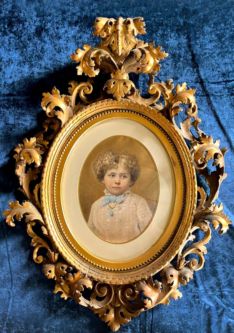
The painted portrait of Joseph Keppler, Jr. measures only 17 x 13 inches. Its incredibly ornate frame more than doubles the size of the portrait, at 37 inches long by 26 inches wide. The carved figure at the top of the frame is almost 6 inches deep.
became a sailor and made his way to the United States, serving in the Civil War before becoming a photographer. By the late 1870s Kurtz was quite well-known as a photographer, and was a pioneer in popularizing the halftone process in the United States, which permitted photographs to be reproduced in print. Both men were German-speaking immigrants and belonged to an affluent German-American singing group known as the Liederkranz that also functioned as a fraternal organization. Though Keppler Sr. was himself a talented artist and could have painted his son himself, commissioning Kurtz may have been a gesture of friendship or professional respect — an act of fraternity within their elite social circle.
Keppler Sr. had risen from modest Austrian immigrant to a man of substantial means, building a large house on top of a hill in Inwood, at the far northern tip of Manhattan. His home would have been richly decorated, filled with luxurious furnishings and objects meant to communicate his family’s status. In the late Victorian era, every item in the household was a statement of social standing. This portrait — likely hung in a formal space such as a parlor or drawing room — would have blended into the surrounding finery. This display of wealth would have been unusual at the time, as cartoonists historically did not make much money. Keppler Sr. was really the first cartoonist in the U.S. to achieve such monumental financial success. True to the spirit of the Gilded Age, even smaller and previously less profitable industries — like cartooning — suddenly found opportunities to expand and thrive on a much larger scale. The frame, as well as the origin of the painting, can be read as a symbol of Gilded Age prosperity and performance, all centered around one golden-haired child.
Keppler Jr.’s sweet, innocent face is overshadowed by the magnificence of the frame, creating a dissonance that would leave most artists (and parents) cringing.
The portrait is a well-executed likeness, showing the young boy’s cheeks glowing with health, a full head of fluffy, golden curls. He wears a white suit with a blue necktie, accessorized with a fine gold necklace. This child is obviously well cared for, raised in comfort. The 19th century is commonly known as the birth of childhood, the first period in which children were seen as innocent and set apart, deserving of care and special attention. Before this era, children were often seen as small adults, and children from the lower classes were put to work at a very young age and expected to shoulder the responsibility of financially contributing to the household. With this context in mind, we can observe that not only is the frame a display of wealth, but also a display of care. Practically, frames are meant to protect paintings from harm. They are also tools to contain the visual field, and enhance it. They have a remarkable ability to elevate or lower a visual moment, acting as a strong signal to the viewer. For instance, if this portrait had been put in a plain, cheap frame, our viewing experience would immediately change, and we would come to different conclusions about the painting. We would assume, for instance, that this was not a precious painting, and therefore perhaps the child was not especially valued. The frame provides an emotional, cultural, and socioeconomic context that fundamentally changes the viewing experience, and this portrait of young Keppler is an excellent example of these contexts and signals.
In the end, the portrait of young Joseph Keppler Jr. — lavishly framed and lovingly rendered — fits squarely into the social and cultural context of a Gilded Age Manhattan mansion. It is the product of a father who had risen swiftly from immigrant beginnings to the peak of professional and social success, eager to surround himself with symbols of both status and sentiment. What might seem garish by today’s standards was, in its time, a potent expression of pride: in wealth, in artistic networks, and, most poignantly, in one’s children. The ornate frame does more than simply house a likeness — it magnifies the message of care, identity, and arrival. Though we will never fully know the emotional dynamics between Joseph Keppler Sr. and his son, the legacy speaks for itself: the younger Keppler honored his father by not only adopting his name but also following his artistic path, continuing the family’s imprint on American satire. This portrait, then, is more than decorative — it is a statement of lineage, ambition, and perhaps an enduring familial bond.
Emotional Baggage
Cheney J. Schopieray
Curator of Manuscripts
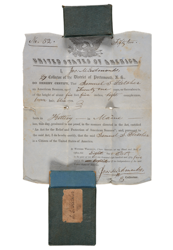
Samuel S. Fletcher followed his father’s footsteps into a career of sailing, beginning at least as early as his teens. He was in his 20s when he tucked his protection certificate into this sleeve. The paper and cardboard interior of this slipcase is protected by a semi-water resistant coating. Once inside, the document is not guaranteed safe but certainly has a better chance of surviving damp misadventures at sea. Papers of sailors and other maritime laborers are found alongside Fletcher’s identification document in the David P. Harris Collection.
The word “baggage” carries with it a sense of weight, bulk, and burden. Travelers’ trunks, barrels, and bags were filled with toiletries, changes of clothing for different social and practical needs, and much else. Moving them required careful packing, management, and manual labor. When Lena Smith planned a Nebraska-to-California trip in November 1904, she contemplated taking the Burlington railroad from Omaha, which had a local ticket opportunity to see friends southwest of Lincoln. This required that she send her luggage separately on a noon train through Lincoln, visit quickly, secure a carriage ride to Fairmont in time to catch the “Flyer,” which would then allow her to meet up with her luggage at McCook, Nebraska, before continuing west to California. After assessing a flurry of potential options sent by a friend, she abandoned her social calls at Lincoln, avoided the complexity of connecting modes of transport, and took the Union Pacific overland directly to Sacramento instead.
Many soldiers, immigrants, indentured and other laborers, itinerant educators and ministers, and homeless people traveled with much less. Their knapsacks, haversacks, parcels, and bags carried what they needed to get to the next town, next bed, next meal, next job. Without the privilege of carriage drivers, porters, or servants, the weight of even a few rudimentary necessities becomes heavy over time. When George Starbird went off to fight in the Civil War in July 1862, he kept it light, with few extras: only needles, thread, labels, pharmaceutical pills, and medical salve.
Though the language is new, the “emotional baggage” of broken hearts and lost loves draws its metaphor from experience well known to 19th-century America.
The word “baggage” also carries with it a sense of necessity or requirement, one that is often reflected in how official papers were conveyed. The security of nationality and citizenship documents was of paramount importance for seafarers and other travelers. Seamen’s Protection Certificates were paper documents issued by Customs Collectors in accordance with a 1796 act of Congress passed to protect sailors from being impressed into service on foreign vessels, particularly British ships. Since these documents connected names with ages, physical descriptions, and other vital information, they were often relied on to prove identity. A sailor without a certificate might start his voyage on an American merchant vessel and end it toiling aboard a British warship. Such a lifealtering (or life-ending) threat prompted sailors and officers to protect these certificates. The weather, the water, regular consultation, and theft were among the dangers that jeopardized these fragile, precious pieces of paper. Twenty-one-year-old sailor Samuel S. Fletcher of Kittery, Maine — 5-foot-5, brown hair, and blue eyes — had his certificate reinforced on one edge so that it could be inserted into a small slipcase and placed in a pocket or small chest for safekeeping at sea.
In the mid-1850s, at a time when passports were largely issued by the country of destination, not origin, American civil engineer Frederick Hubbard (1817-1895) embarked on a grand tour of Europe and the near East. As he passed through Greece, Messina, Naples, Rome, Paris, London, Tunis, Algiers, Tangiers, Gibraltar, Spain, and elsewhere, consulates added stamps, signatures, and partially printed pages to his passport by affixing them along the edges. As the document grew in length, it was folded, then rolled. It was kept in an oval tin tube to keep it from becoming too worn, tearing, or suffering other damage. Nevertheless, by the time it arrived at the Clements Library in the 1990s, it was in tatters.
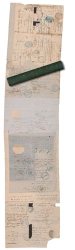
By the time the Clements Library staff first removed Frederick Hubbard’s x 24 cm (~9.5″) x 108 cm (~42.5″) passport from its tin tube, it suffered from split seams; tears bit into its edges, small sections were missing, and the different types of adhesives had in places lost their hold. In 2014 Clements Library Conservator Julie Fremuth carefully addressed its many issues, and now it is safely accessible (outside its container!) in the Thomas, Robert, and Frederick Hubbard Family Papers, 1803-1902.
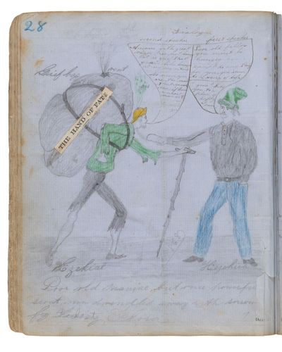
Visual metaphors such as scout Ezekial’s “grief bag” spewing out its gas of “hope” under the auspices of “The Hand of Fate” are found throughout the Illustrated Scrapbook, [1850s–1870s], acquired by the Clements Library in 2022.
Travel documents and clothing and other personal effects took material forms that dictated the shape of the items that carried them. Trunks, suitcases, barrels, slipcases — all were designed to hold and protect particular things, and all required different forms of labor to move them around.
But the things that travelers in the past packed into containers were not always transported by strong backs, seasoned arms, and muscled legs. “Emotional baggage” is a modern term — its earliest currently known use in print is from around the time of Lena Smith’s trip from Omaha to Sacramento. Terms such as “intellectual baggage” and “political baggage,” with similar figurative concepts, reach back to Shakespeare’s Hamlet. They express how a person’s past actions, experiences, knowledge, feelings, attitudes, and beliefs encumber them in internal, interpersonal, and community relationships in the present.
Sometime in the 1850s, a young man — perhaps James R. Reeves of Kennebec County, Maine, or a family member — took a partially printed volume of blank receipts and turned it into a combination scrapbook, drawing pad, and handwritten storybook. The narrative portion follows the adventures of Ezekial and Hezekiah, both young scouts, and focuses on Ezekial as he wends his way through life’s challenges. Our protagonist suffers from despair and heartbreak as he and Hezekiah court the same young woman, Flora. The illustrator visualizes loss of hope through a remarkable yellow hat that spews “gas of hope” from the head of the despairing. This page shows the “Poor old maniac,
but once powerful scout, now dwindled away with sorrow for the lost Flora.” His bent body and tattered clothes are weighted down by the “grief bag” he shoulders, also presumably leaking hope from a tear in its fabric. His rival Hezekiah reaches out to offer the beleaguered young man something to eat, attempting to offer some solace. “Poor old fellow you must be hungry. Can I do anything for you, you seem to be weary of life. I guess I take you to a place of safety at once.” Ezekial responds “with great vigor”: “I’m not hungry it is grief that gnaws like hunger at my very vitals. No never. You are the man that ruined me, if I was a smart man as I … I would kill you.”
Horace P. Bigelow, an in-law of the prominent Van Vechten and Huntington families of central New York state, beautifully rendered his and his sister’s feelings of “regret” into parcel form on April 8, 1865. The siblings wrapped their lamentations about not being able to visit in cloth and tied it with string, a tidy bundle of sadness.
The boxes, trunks, bags, and satchels people carried with them provided them with comfort in knowing they would have belongings at their destinations, while simultaneously creating stress over the weight and management of heavy trunks, and the dangers of damage or loss in transit. The tins, slipcases, suitcases, and chests that protected papers mitigated the risks of traveling with them but required forethought and preparation. Though the language is new, the “emotional baggage” of broken hearts and lost loves draws its metaphor from experience well known to 19th-century America. It was a life of carrying the heavy bag, assessing the risk, arranging the next stop, and ultimately making it beyond the regrets of the letter’s introduction to the present. Or not. In the case of Horace Bigelow’s April 8, 1865, letter, we find that he made it quickly past the regrets and on to news of their lame horse that had not recovered — “whence these tears.”
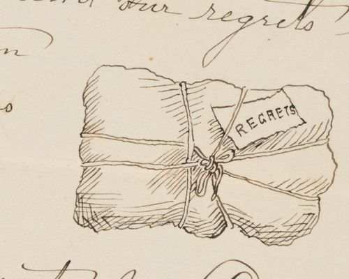
Horace P. Bigelow peppered his correspondence with illustrations, including this parcel of “regrets” offered to the recipient. His correspondence, along with a wealth of sources pertinent to the intermarried Bigelows, Huntingtons, Van Vechtens, Christies, and Danns are available for research thanks to gifts from family member and former Clements Library Director John C. Dann.
Developments & Staff News
"Pass the Hat"
Angela Oonk
Director of Development
I donned my thinking cap to contemplate the packaging of donations to the Clements, but envelopes and boxes seemed a bit old hat to write about. While I tip my hat to the delightful stamps donors use, and the notes and cards that sometimes accompany checks, those don’t really speak to the containers themselves. Those items do, however, tell the story of deeper connection and community that we often see among our supporters.
I’m willing to hang my hat on this: At its heart, fundraising has origins rooted in community spirit. The Clements Library Associates started as a group of volunteers who spent time together raising funds for acquisitions at the Clements. Today, our donors hail from around the world.
With a bee in my bonnet, I returned to the theme at hand: A hat turned upside down makes an excellent container! During a vacation this summer along Lake Michigan, my hat came in handy for gathering rocks at the beach. Impromptu fundraising campaigns of the past could be conducted by passing a hat through the audience. At the drop of a hat everyone had a stake in the outcome, and every contribution, no matter how small, was recognized as part of the solution.
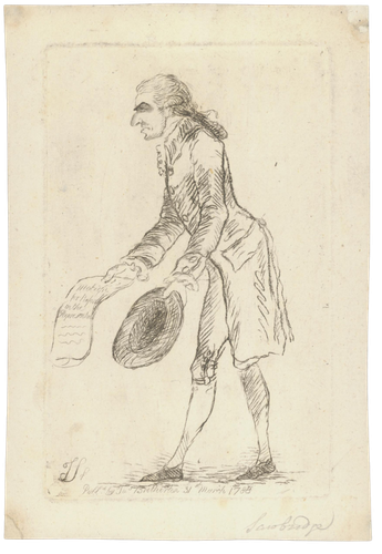
James Sayer produced this etching in 1788 of Alderman John Sawbridge holding out his hat in supplication with a paper inscribed, “Motion for a Reform in the Representation.”
The Clements Library Associates started as a group of volunteers who spent time together raising funds for acquisitions at the Clements. Today, our donors hail from around the world.
The tradition of passing the hat reflects the power of grassroots fundraising. Now, we can be part of a community like the Clements Library Associates even when we are too far apart to place our contributions into a physical hat. As new needs arise at the Clements, online crowdfunding campaigns have brought people near and far together as they pool their resources in a virtual contribution box.
We invited you to throw your hat in the ring by participating in a recent crowdfunding campaign, “Bit by Bit: Digitizing Clements Collections.” These donations help make invaluable primary sources available online, anytime, anywhere, for free. To do this critical work, we need specialized, state-of-the-art digitization equipment that costs $50,000. This machine is specifically designed to be safe enough to work with fragile and valuable collections like those at the Clements. This is just one example of the power of coming together and passing the hat to bolster the work at the Clements Library. Hats off to our supporters and friends!
As you may know, I wear many hats in my role at the Clements. Once a month, I look forward to hosting The Clements Bookworm gathering together on Zoom to discuss books and historical topics. The virtual circle is further strengthened through engaging conversations and thought-provoking questions among participants. Our west coast friends deserve a feather in their caps for arising at the crack of dawn to join us for the live broadcast. We’re not talking through our hat — this year, the registrations for the Bookworm surpassed 2,500.
In other news, hold on to your hats, because we have begun marking important milestones in celebrating the U.S. Semiquincentennial like the upcoming student-curated exhibit marking the 250th anniversary of the publication of Thomas Paine’s Common Sense. The Clements collections offer a rich array of materials to better understand the conflict and follow the variety of individuals impacted.
Please invite your friends to visit the Clements — there is no reason to keep the information under your hat. (As an aside, do you know that Abraham Lincoln kept important papers in his top hat?) After all, it’s not too late to visit even if you graduated and threw your cap in the air!
Staff News
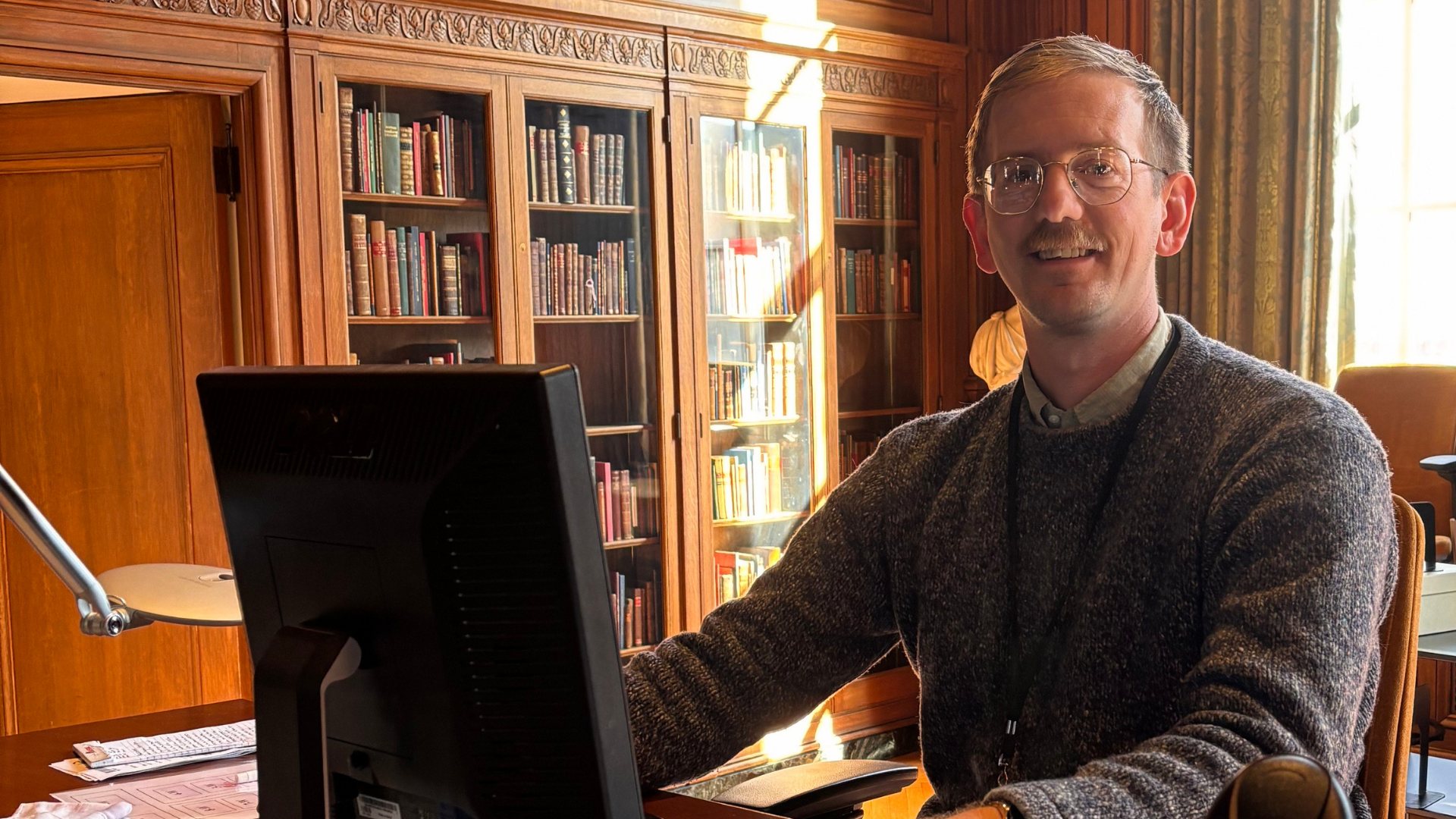
Longtime Head of Reader Services Terese Murphy retired in early August. Terese first joined the Clements as a volunteer, and then later joined the staff, processing and cataloguing maps before spending fifteen years managing the library’s reading room and remote reference requests. Of more relevance to readers of this publication, she also served as editor of The Quarto. She has been succeeded by Joshua Sulser, who joined the staff in late August. Josh previously served as the Librarian of the Ingalls Library at the Cleveland Museum of Art. An Ohio native, Josh received his BA from Ohio Wesleyan University and his MLIS from Kent State University. We’re delighted to have Josh as a member of the Clements Library team! And congratulations to Terese on her retirement!
Curator of Books and Digital Projects Librarian Emiko Hastings published a review of Kate Ozment’s The Hroswitha Club and the Impact of Women Book Collectors in the September 2025 issue of The Papers of the Bibliographical Society of America.
Curator of Maps and Graphics Sierra Laddusaw attended the 2025 annual meeting of the Western Association of Map Libraries (WAML) in Moscow, Idaho. She co-led a pre-conference session on the future of the Online Guide to U.S. Map Collections. She also gave a presentation titled “Come to dwell among us”: Maps, Monsters, and a First Year Literature Course.” The presentation focused on how map librarians can adapt techniques students are learning in class for thinking about and critiquing literature to cartographic materials.
Associate Curator of Manuscripts Jayne Ptolemy presented at the Organization of American Historians conference in Chicago in April. Jayne was part of a panel called “Joy and Pleasure in the Early Republic,” organized by the Society for Historians of the Early American Republic. Her paper, “Interrupted Histories,” looked at evidence of interruption in manuscript sources to consider how people overcame (or at least acknowledged) the ever-present reality of distraction, and showed how irritating annoyances can shift into moments of community and connection.
Librarian for Instruction and Engagement Maggie Vanderford was awarded the University Librarian Recognition Award at the annual faculty awards ceremony on October 30. The award recognizes active and innovative early career achievement in library, archival or curatorial services. The award is a wonderful recognition of Maggie’s standing as a campus leader in library instruction.
This fall semester, the Clements Library has fourteen student workers and interns working at the library—an all-time high. (You can read about them on the Clements Chronicles blog.) They include undergraduates (majoring in fields from public policy to statistics to German) as well as graduate students in U-M’s School of Information. Thanks to all of the members of the Clements Library Associates whose gifts have helped support these important work opportunities.
In Memoriam

Brian Leigh Dunnigan
Many members of the Clements Library community will share our deep sadness at the passing of Brian Leigh Dunnigan, Curator Emeritus of Maps. Brian passed away in Spring Arbor, Michigan on April 10, 2025, following a struggle with Parkinson’s disease.
Born in Detroit in 1949, Brian developed a lifelong passion for early American history—especially the French and Indian War, the Great Lakes, and the War of 1812. He was the son of Dorothy and James Dunnigan, one of Mackinac Island’s longest serving State Park Commissioners.
Brian spent his childhood and many summers on Mackinac Island, where he worked for ten seasons as a historic interpreter at Fort Mackinac and conducted research on the fort’s special collections related to the history of the island and its military outpost.
Brian earned both his undergraduate and graduate degrees in history from the University of Michigan, followed by a second graduate degree in museum management from Cooperstown Graduate Program in Cooperstown, New York.
He became the first Director of Historic Fort Wayne in Fort Wayne, Indiana, before moving on to direct and oversee the development of Old Fort Niagara in Youngstown, New York. During his tenure, Brian established numerous historical reenactment programs and publications, and fostered cross-border collaborations with Fort George in Niagara-on-the- Lake, Ontario, and Fort York in Toronto. He also served as an adjunct faculty member at the University at Buffalo.
Among his many accomplishments at Old Fort Niagara, one of the most significant was the return and restoration of the fort’s historic War of 1812 flag from Megginch Castle in Scotland to its home in Youngstown, New York. In 1996, Brian joined the Clements Library as the Curator of Maps.
In addition to caring for the map collections and pursuing his own research, Brian expanded his responsibilities to serve as the Clements’ Interim Director from 2007 to 2008 and was appointed Associate Director in 2010. He also provided leadership for the library’s fellowship programs and served as editor of The Quarto
His scholarly achievements were numerous, but among his most notable publications are Frontier Metropolis (2001) and A Picturesque Situation (2008), both of which reflect his deep expertise and enduring passion for early American history and cartography.
Brian retired from the Clements in July of 2019. In recognition of his many contributions, the Clements Library established the Brian Leigh Dunnigan Fellowship in the History of Cartography to support researchers using the library’s collections of maps. Brian is deeply missed by all of his former colleagues for his vast knowledge of the library’s map collection, as well as his thoughtfulness, generosity, and good humor.

Randolph G. Adams Director of the Clements Library
Paul J. Erickson
Committee of Management
Domenico Grasso, Chairman
Gregory E. Dowd, Derek J. Finley, James L. Hilton, David B. Walters.
Paul J. Erickson, Secretary
Clements Library Associates Board of Governors
Bradley L. Thompson II, Chairman
John R. Axe, John L. Booth II, Kristin A. Cabral, C. Wesley Cowan, Charles R. Eisendrath, Derek J. Finley, Margaret N. Harrington, Eliza Finkenstaedt Hillhouse, Troy E. Hollar, Martha S. Jones, Christina A. Karas, Sally Kennedy, Joan Knoertzer, James E. Laramy, Ole Lyngklip, Drew Peslar, Richard Pohrt, Catharine Dann Roeber, Estrella Salgado, Anne Marie Schoonhoven, Harold T. Shapiro, Arlene P. Shy, James P. Spica, Edward D. Surovell, Irina Thompson, Benjamin Upton, Leonard A. Walle, David B. Walters, Clarence Wolf.
Paul J. Erickson, Secretary
Clements Library Associates Honorary Board of Governors
Peter N. Heydon, Chair Emeritus
Joanna Schoff, Harold T. Shapiro
Clements Library Associates share an interest in American history and a desire to ensure the continued growth of the Library’s collections. All donors to the Clements Library are welcomed to this group. The contributions collected through the Associates fund are used to purchase historical materials. You can make a gift online at leadersandbest.umich.edu or by calling 734-647-0864.
Published by the Clements Library
University of Michigan
909 S. University Ave. • Ann Arbor, Michigan 48109
phone: (734) 764-2347 • fax: (734) 647-0716
Website: https://clements.umich.edu
Savitski Design, Ann Arbor
Regents of the University
Jordan B. Acker, Huntington Woods; Michael J. Behm, Grand Blanc; Mark J. Bernstein, Ann Arbor; Paul W. Brown, Ann Arbor; Sarah Hubbard, Okemos; Denise Ilitch, Birmingham; Carl J. Meyers, Dearborn; Katherine E. White, Ann Arbor.
Domenico Grasso, ex officio
Nondiscrimination Policy Statement
The University of Michigan, as an equal opportunity/affirmative action employer, complies with all applicable federal and state laws regarding nondiscrimination and affirmative action. The University of Michigan is committed to a policy of equal opportunity for all persons and does not discriminate on the basis of race, color, national origin, age, marital status, sex, sexual orientation, gender identity, gender expression, disability, religion, height, weight, or veteran status in employment, educational programs and activities, and admissions. Inquiries or complaints may be addressed to the Senior Director for Institutional Equity, and Title IX/Section 504/ADA Coordinator, Office of Institutional Equity, 2072 Administrative Services Building, Ann Arbor, Michigan 48109-1432, 734-763-0235, TTY 734-647-1388, [email protected]. For other University of Michigan information call 734-764-1817.